Elegant U-Shaped Kitchens Plans: Versatility Meets Aesthetics
U-Shaped Kitchens are renowned for their efficiency and optimal use of space.
At the heart of modern home design lie U-Shaped Kitchens, a configuration that masterfully merges functionality with style.
As the name suggests, U-Shaped Kitchens are made up of various kitchen units arranged on three adjacent walls, forming the shape of the letter ‘U’.
This layout not only optimizes the workspace but also creates an intimate setting that facilitates efficient movement and workflow.
One of the standout features of Elegant U-Shaped Kitchens Plans is their adaptability.
Depending on the available space and homeowner preferences, they can be easily amplified by adding a central kitchen table or an island, turning them into both a cooking and social hub.
For those who prefer a seamless integration of cooking and dining, U-shaped kitchens can harmoniously combine with dining areas.
And if you’re working with a broader space, you could even incorporate a living area, transforming the kitchen into the epicenter of home activities.
U-Shaped Kitchens: Maximizing Efficiency and Flow
Many homeowners prefer U-Shaped Kitchens because they provide three walls of cabinetry and countertop space. Open-plan designs further enhance the versatility of U-Shaped Kitchens.
An open layout frequently provides the perfect opportunity to transition one arm of the ‘U’ into a functional peninsula.
This can be accessible from both sides, serving dual purposes – perhaps one side offers a breakfast bar for casual meals, while the other provides additional storage volume.
In summary, Elegant U-Shaped Kitchens Plans are more than just a layout.
They represent a thoughtful integration of space, function, and aesthetics, offering homeowners a platform to personalize their kitchen space to match their unique lifestyles and preferences.
Types of Kitchen Layout
Single Wall Layout: The Epitome of Simplicity and Efficiency
A single wall layout, as the name suggests, is a kitchen design where all the appliances, cabinets, and countertops are aligned along a single wall.
This design is especially prevalent in small homes, studio apartments, and loft spaces, where conserving floor space is a priority. Here’s a deeper dive into the nuances of this layout:
Space Efficiency
Single wall kitchens are the most space-efficient of all layouts. They’re perfect for open floor plans as they free up the rest of the space for dining or living areas.
Simplicity
With everything laid out on one wall, the design and installation process is straightforward, often making it a cost-effective option.
Workflow
Even though it’s compact, the workflow in a single wall kitchen can be quite effective, especially if the refrigerator, stove, and sink are placed in a functional sequence.
Adaptability
A single wall layout can be easily adapted to incorporate a kitchen island opposite the wall, converting it into a galley-style layout if more counter space or storage is needed.
Aesthetic Appeal
Given the open nature of this layout, it’s easy to make it an integral part of the living space.
With the right design choices in cabinetry and appliances, a single wall kitchen can be a stylish addition to the overall home decor.
Challenges
The main challenge of a single wall kitchen is limited counter space and storage.
However, with innovative solutions like tall vertical storage, pull-out pantries, and multifunctional appliances, these challenges can be mitigated.
In conclusion, while single-wall layouts might seem limiting at first, they offer a world of possibilities in design and functionality, especially in homes where space is at a premium.
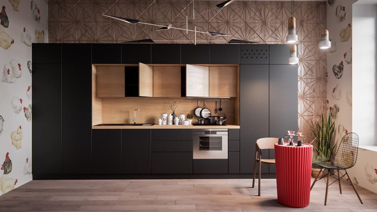
L-Shaped Layout: Combining Functionality with Openness
The L-Shaped kitchen layout is one of the most popular and versatile kitchen designs, especially suitable for small to medium-sized kitchens.
It consists of countertops on two adjoining walls that are perpendicular, forming an “L” shape. Here’s a detailed exploration of this layout:
Optimized Corner Space
One of the main advantages of the L-Shaped layout is the efficient use of corner space, which often goes wasted in other kitchen designs.
Corner cabinets and innovative storage solutions can help utilize this space to the fullest.
Versatile Work Triangle
The L-Shaped kitchen often allows for a perfect work triangle, with the sink, refrigerator, and stove set up in a way that ensures easy and efficient movement.
Open Plan Potential
This layout is ideal for open-plan living, as it can easily integrate with dining or living areas.
It also offers the possibility to add an island, provided there’s enough space, turning it into a social hub and adding extra workspace.
Aesthetic Flexibility
The L-Shape offers a wide range of design possibilities. Whether you’re going for a modern, minimalist look or a more traditional design, this layout provides ample opportunities to infuse your personal style.
Safety
Since it spans only two walls, there’s lesser foot traffic, making the L-Shaped kitchen a safer choice, especially in homes with kids.
Challenges
While the L-Shape makes good use of corner spaces, these corners can sometimes become “blind spots” or hard-to-reach areas.
However, with solutions like Lazy Susans or corner pull-out drawers, these challenges can be effectively addressed.
In conclusion, the L-Shaped kitchen layout is both functional and adaptable.
It caters to a variety of home designs and sizes, allowing homeowners to customize it based on their needs and preferences.
With the right design elements, it can become the heart of the home, blending usability with aesthetic appeal.
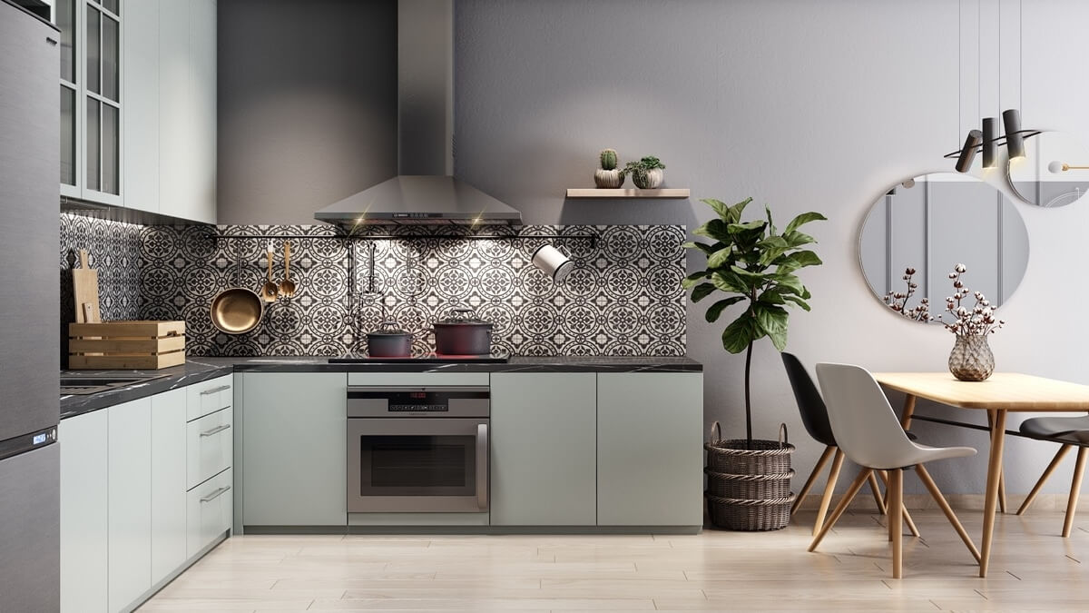
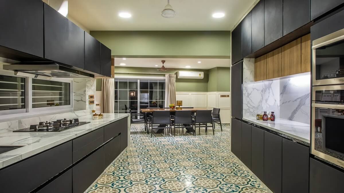
Galley Shaped Layout: Maximizing Efficiency in Narrow Spaces
The Galley kitchen, also known as a walk-through kitchen, is characterized by two parallel runs of cabinets and countertops with a walkway in between.
It’s a design that draws inspiration from the compact, functional kitchens found on ships. Here’s a closer look at the Galley layout:
Space-Saving Design
Galley kitchens are a hallmark of spaces where width might be constrained.
They effectively utilize the available length, offering plenty of preparation and storage space on either side.
Optimized Workflow
With the work areas divided between two sides, there’s a clear and efficient path of movement.
This ensures that everything remains within arm’s reach, making cooking and preparation a streamlined process.
Potential for a Work Triangle
The refrigerator, sink, and stove can be positioned in a way that each point of the work triangle is on a separate wall, further optimizing the cooking workflow.
Ideal for Solo Cooks
Due to its compact nature, the Galley layout is often preferred by professional chefs and solo cooks.
It ensures minimal movement, with everything easily accessible.
Adaptable
One side of a Galley kitchen can be opened up to the dining or living area in open-concept homes, transforming one of the runs into a breakfast bar or a serving counter.
Challenges
Galley kitchens can sometimes feel enclosed, especially if both sides are lined with upper cabinets.
Moreover, they may not be ideal for multiple cooks due to the narrow walkway.
To overcome the feeling of confinement, one can opt for open shelving or lighter colors to create an illusion of space.
In conclusion, Galley Shaped Layouts, while traditionally associated with smaller spaces, can be a powerhouse of efficiency and functionality.
With thoughtful design choices, a Galley kitchen can transform into a beautiful and efficient culinary space that caters to the needs of modern homeowners.
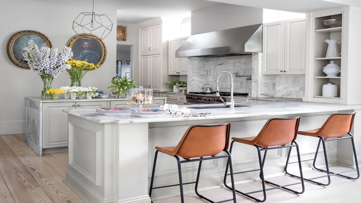
U-Shaped Kitchens with a Peninsula Shaped Layout: A Blend of Efficiency and Versatility
U-shaped kitchens have long been revered for their comprehensive work zones and ergonomic design.
However, when combined with a Peninsula Shaped Layout, they gain an added layer of functionality and flair.
Unlike an island that stands freely in the center of a kitchen, a peninsula is attached on one side, essentially turning a U-shaped kitchen into a G-shaped one.
Here’s a closer look at this dynamic combination:
Enhanced Workspace
The primary advantage of incorporating a Peninsula Shaped Layout in U-shaped kitchens is the added counter space.
Whether it’s for food prep, serving, or as a breakfast bar, a peninsula proves invaluable.
Seamless Flow
A peninsula acts as a natural bridge between the kitchen and adjacent living or dining areas.
It allows for better interaction and creates an open feel without sacrificing the structural advantages of U-Shaped Kitchens.
Versatile Seating Options
With the addition of a few stools, the peninsula can transform into a casual dining spot or a coffee corner, making the kitchen more multifunctional.
Additional Storage
The base of the peninsula can house cabinets, drawers, or even appliances, ensuring that every inch of space is put to good use.
Defined Zones
While U-Shaped Kitchens are inherently efficient, adding a peninsula further delineates the cooking zone from the dining or living areas, especially in open-plan homes.
In conclusion, by merging the efficient design of U-Shaped Kitchens with the adaptability of a Peninsula Shaped Layout, homeowners can enjoy a kitchen space that’s both functional and socially inviting.
It’s a design choice that harmoniously blends the best of both worlds.
U Shaped Layout
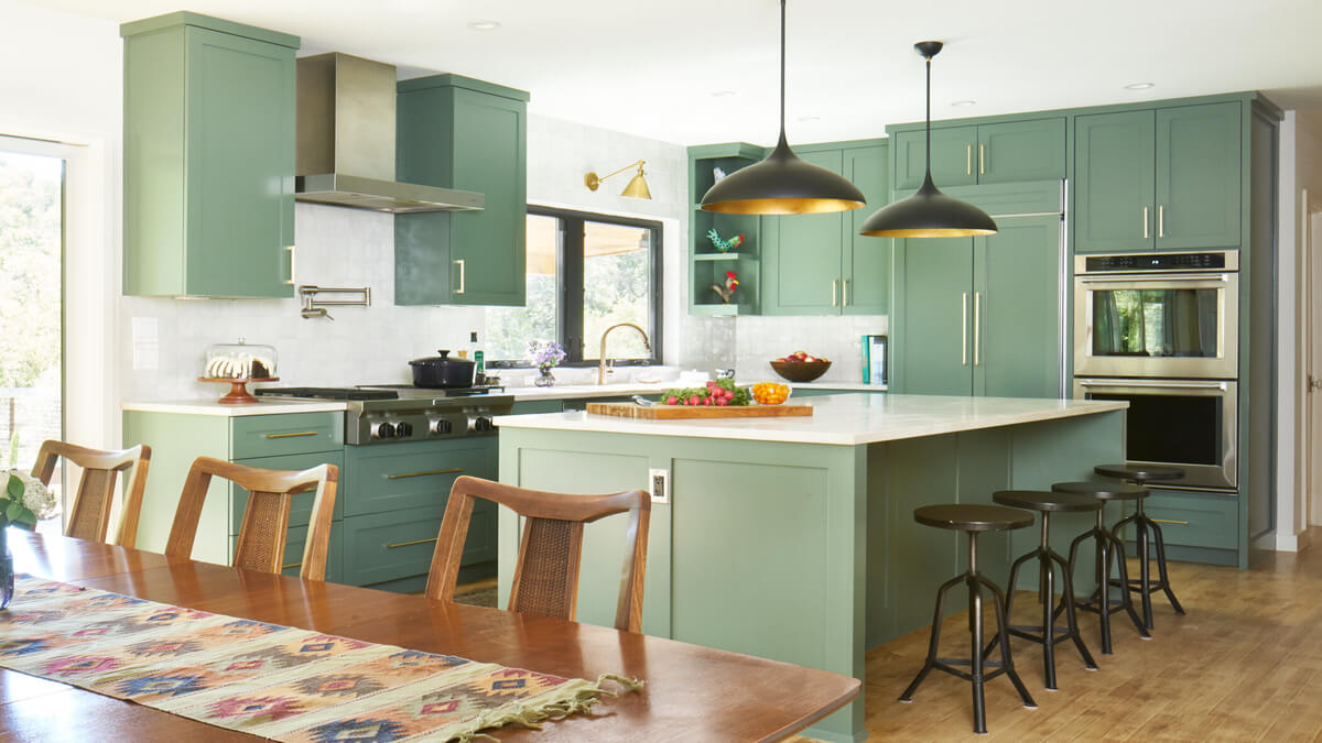
Island Shaped Kitchen
Layouts and the Evolution of Kitchen Design
Your overview of kitchen layouts and the evolution of kitchen design is quite comprehensive.
Here are a few additional insights and ideas to enhance your understanding:
Zoning
Modern kitchen designs often emphasize zoning. Zones are areas dedicated to specific tasks like prep zones, cooking zones, cleaning zones, and storage zones.
Each zone is equipped with everything necessary for its specific task.
Ergonomics
An ergonomic kitchen design ensures that everything is within easy reach, and you don’t need to bend or stretch excessively.
Drawers, for instance, are becoming more popular than cabinets as they allow easy access to items without having to crouch down or reach to the back.
Open Concept
Many modern homes opt for an open concept kitchen that flows into the dining or living room.
This design promotes interaction and socializing, making the kitchen not just a place to cook but a space to gather and communicate.
Smart Kitchens
With the advent of smart home technology, kitchens too are becoming smarter.
From fridges that notify you when you’re running low on groceries, to smart faucets and lights that you can control with voice commands, technology is becoming a staple in modern kitchens.
Sustainability
More homeowners are considering sustainable solutions in their kitchen designs.
This can include energy-efficient appliances, sustainable materials for countertops and cabinets, and a design that maximizes natural light.
Materials and Finishes
Trends in kitchen materials and finishes evolve. Currently, matte finishes, especially for countertops and cabinets, are becoming popular.
Quartz countertops, known for their durability, are also a trend in many modern kitchens.
Lighting
The importance of good lighting can’t be overstated. Layered lighting, which involves having multiple light sources for different purposes like task lighting, ambient lighting, and accent lighting, can elevate the functionality and aesthetics of a kitchen
Storage Solutions
Innovative storage solutions, such as pull-out pantries, deep drawers, and vertical storage, are being incorporated to utilize every available inch of the kitchen space efficiently.
In summary, the modern kitchen is not just a place for cooking.
It’s a multifunctional space that, when designed well, can enhance the living experience, promote interaction, and make day-to-day tasks easier and more enjoyable.
10 Killing U-Shaped Kitchens
U-Shaped Kitchens have been a favorite choice for homeowners who wish to maximize their space while ensuring an elegant and efficient layout.
What’s most advantageous about them is the flexibility to Customize the Design based on personal preferences and the specific architecture of the home.
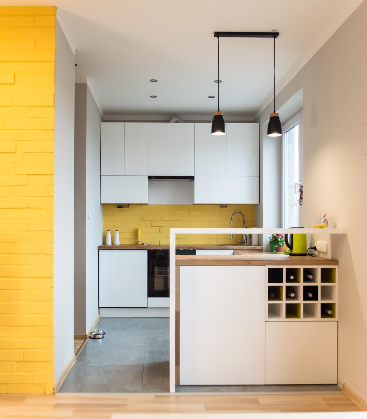
In a recent, trendy setup, cabinets stretch across one side and seamlessly face out to the living area.
This positioning creates a harmonious blend between the kitchen and living spaces.
A notable feature in some of these designs is a sophisticated wine rack, conveniently placed for those who love to entertain.
Adjacent to it, there’s a raised bench, designed meticulously, so that one can effortlessly showcase a wine bottle.
The combination of functionality with aesthetic appeal is one reason why U-shaped kitchens have gained immense popularity.
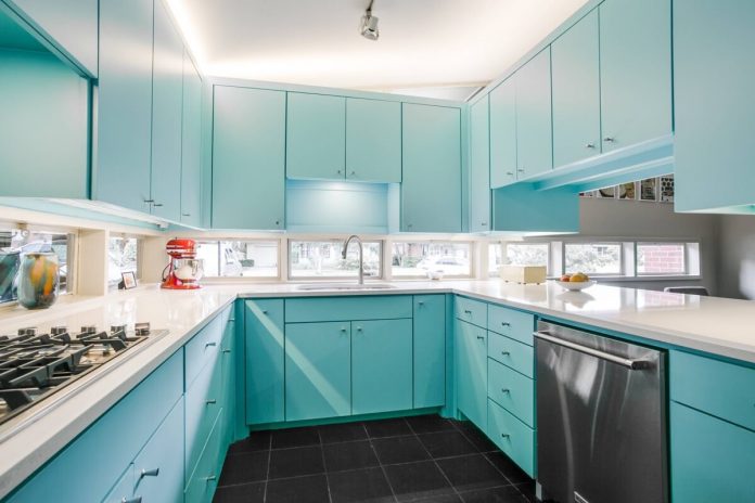
Blue U-Shaped Kitchens: A Breath of Fresh Elegance
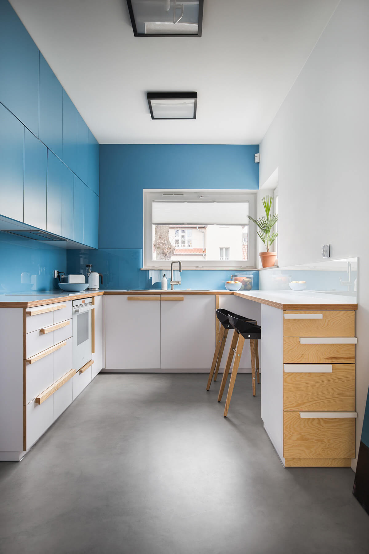
Stepping into the realm of blue U-Shaped kitchens, one is instantly greeted by a refreshing change in design perspective.
This particular blue kitchen beautifully reinvents the traditional layout. With wall cabinets embracing the entirety of the U-shape, it carves a distinct identity for itself.
Despite the all-encompassing cabinetry, the design cleverly maintains a sense of openness.
One side seamlessly flows into the dining room, enhancing accessibility and interaction.
The real masterstroke, however, is the introduction of windows running around the majority of the countertop level.
This not only floods the space with natural light but amplifies the kitchen’s airy ambiance.
However, with elegance comes a quirky challenge. The pristine ceramic tiles, reflecting the light from the windows, make post-dinner cleaning akin to window washing!
It’s a playful twist in the chore routine, reminding us that beauty sometimes comes with its own unique demands in the world of blue U-Shaped kitchens.
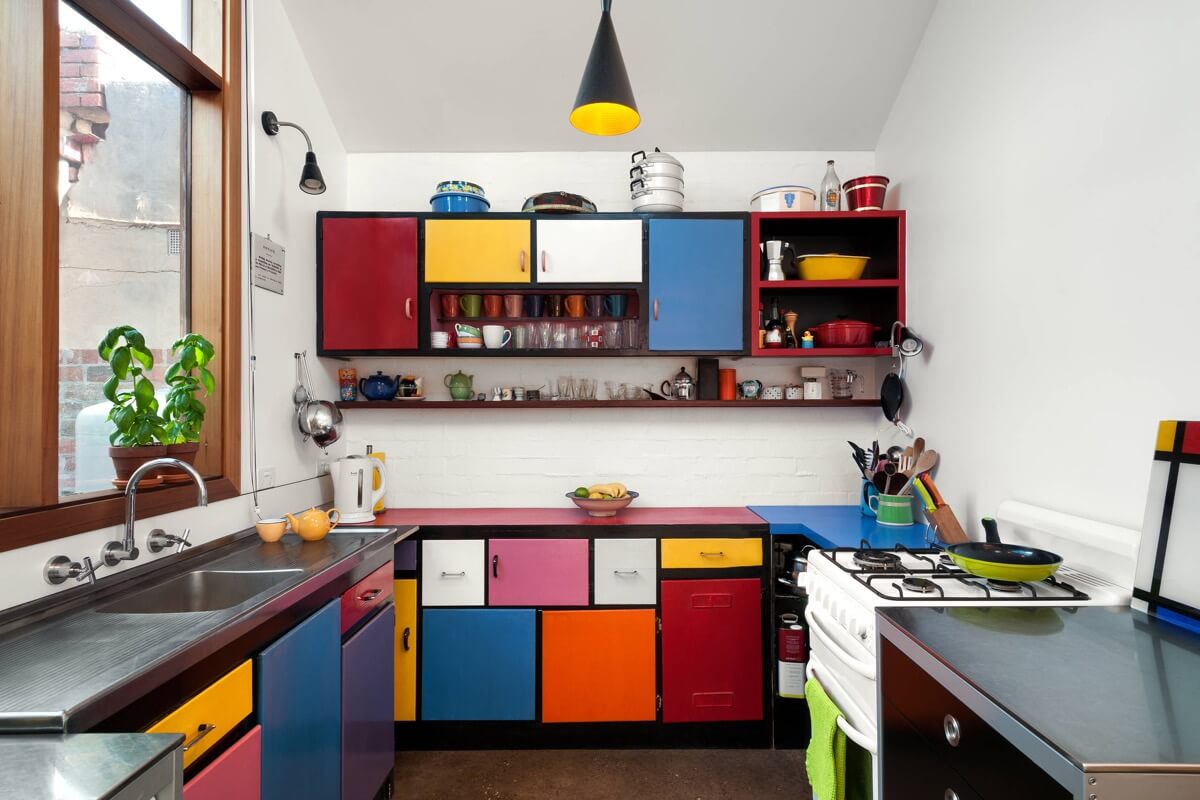
Multi-Coloured Cabinets: A Palette of Possibilities
Struggling to settle on a single shade for your kitchen cabinets? The world of design offers a solution that’s both artistic and vibrant.
Drawing inspiration from the works of Piet Mondrian, a pioneer in the modern abstract art movement, you can embrace a symphony of colours in your kitchen.
Mondrian’s style was characterized by grids of vertical and horizontal lines filled with primary colours.
Adapting this into your interior design, imagine your kitchen cabinets as a canvas, with each door and drawer front painted in a different, bold hue.
The juxtaposition of reds, blues, yellows, and even crisp whites and blacks can create a dynamic and visually arresting look.
This approach not only infuses a playful energy into the kitchen but also allows you to incorporate multiple colour palettes that can be coordinated with various elements of your kitchen decor.
Think of white countertops punctuated with blue and red accessories, or black bar stools that resonate with the black grids of a Mondrian masterpiece.
Incorporating multi-coloured cabinets inspired by art can transform your kitchen from a mere functional space to an avant-garde statement, celebrating the blend of culinary and visual arts.
Dive into this palette of possibilities, and let your kitchen tell a vibrant story of its own!
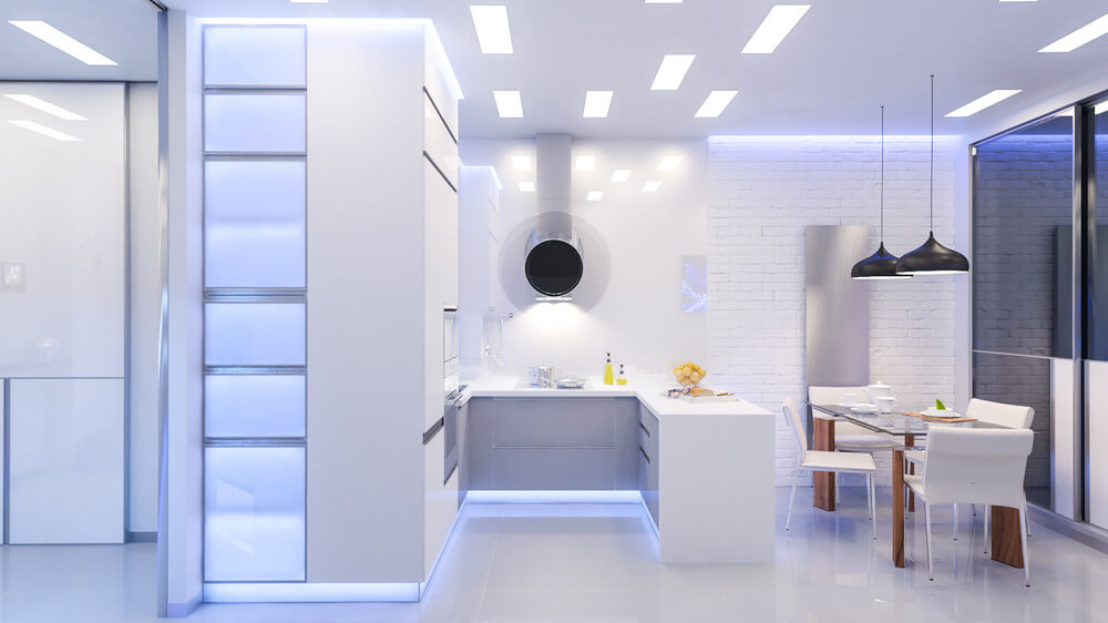
Extractor Unit: The Centrepiece of Modern Kitchens
In the evolving world of kitchen design, functionality meets aesthetics in the most unexpected ways.
One of these is the transformation of the humble extractor unit from a mere appliance to a potential design focal point.
Choosing an extractor unit as the key focus of your kitchen can not only optimize functionality but also elevate the overall ambiance of the space.
Why Choose an Extractor Unit as the Key Focus?
Statement Design
Contemporary extractor units come in a range of designs, from sleek, minimalistic hoods to sculptural pieces that resemble modern art.
A bold, eye-catching extractor can serve as a conversation starter.
Enhanced Functionality
Modern extractors are equipped with advanced features such as noise reduction, energy efficiency, and integrated lighting.
By making it the focus, you ensure optimal air quality without compromising on aesthetics.
Space Optimization
Ceiling-mounted or island extractors can free up valuable space around the cooking area, creating an open and airy feel.
This can be particularly beneficial for kitchens with an open-plan design.
How to Make the Extractor Unit Stand Out?
Material & Finish
Opt for materials and finishes that contrast or complement your kitchen’s color scheme. Brushed steel, matte black, or even glass can make the extractor pop.
Integrated Lighting
Many high-end extractors come with built-in lighting solutions. Choose one with ambient or adjustable lighting to add mood and functionality to the kitchen.
Surrounding Elements
Ensure the backdrop or surrounding elements don’t overshadow the extractor.
If it’s a ceiling-mounted model, consider a contrasting ceiling color. For wall-mounted options, the backsplash can be kept simple to make the extractor stand out.
Positioning
If you have an island, a centrally placed extractor can be the crowning glory.
It not only provides effective ventilation for all sides but also creates a symmetrical and balanced look.
In conclusion, while the extractor unit might traditionally be viewed as a necessary kitchen utility, with thoughtful design and placement, it can easily transition into the kitchen’s show-stopping centrepiece.
So, as you design or renovate your kitchen, give the extractor unit the spotlight it rightfully deserves.
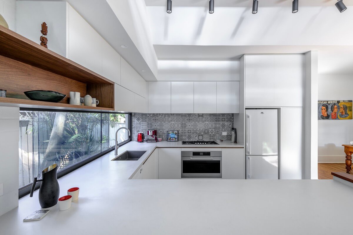
U-Shaped Kitchens: The Elegance of Dark Wood Tone
Within the world of modern kitchen designs, U-Shaped kitchens have emerged as a favorite among homeowners.
Their seamless design, efficient layout, and inherent durability make them a top choice.
But, what sets a U-Shaped kitchen apart even further is the ability to play with design nuances.
Imagine walking into an all-white U-Shaped kitchen. The monochromatic palette is soothing, providing a sense of spaciousness and purity.
However, amidst this uniformity, a niche shelf grabs your attention.
It isn’t painted white like the rest. Instead, it boasts a Dark Wood Tone, standing out in contrast and immediately drawing the eye.
This use of Dark Wood Tone against the all-white backdrop does more than just add a design element.
It brings warmth, character, and a touch of timeless elegance to the kitchen.
The depth and richness of the wood stand in stark contrast to the white, creating a visual interplay that’s both inviting and sophisticated.
Such design choices underscore why U-Shaped kitchens are popular.
It’s not just about their inherent durability; it’s also about the versatility they offer in customization and design.
So, when considering revamping or designing your kitchen, think about the magic of contrasts and the elegance of Dark Wood Tone.
It might just be the touch of sophistication your kitchen needs.
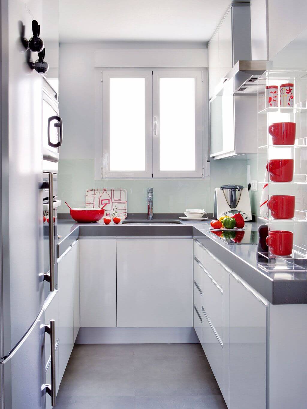
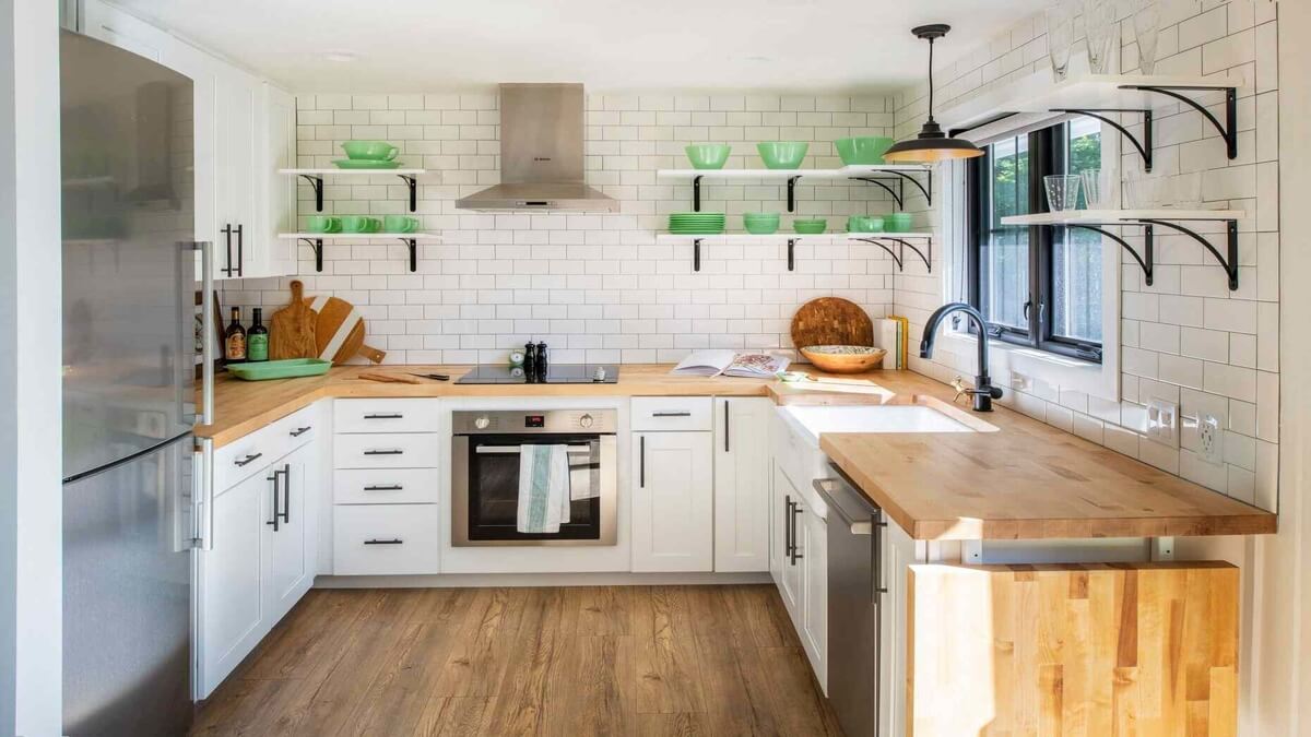
U-Shaped Kitchens: Brighten Up with Colourful Utensils
One of the key attractions of U-Shaped Kitchens is their expansive countertop space and efficient layout.
While some homeowners prefer a monochromatic or muted color scheme for the cabinets, there’s no need for the entire kitchen to stay neutral. Bring in vibrancy with Colourful Utensils!
You don’t have to make permanent or expensive changes to refresh the look of your kitchen. Instead, let the hues shine through the everyday items.
Start by introducing bright coloured mugs that can be displayed on open shelves or hooks.
Colourful trays not only serve functional purposes but also act as statement pieces when they contrast with a neutral countertop.
Don’t forget the hand towels – a seemingly small accessory, but when chosen in bright shades or patterns, they can add a significant pop of colour.
The idea is to colour the room with easily replaceable items. This way, if you decide to switch up the theme or if a particular trend fades, you’re looking at a decor adjustment that’s both low-effort and low-cost.
U-Shaped Kitchens, with their open and accessible layout, become the perfect canvas for such vibrant and ever-changing decor using Colourful Utensils. The result?
A lively, dynamic space that’s always in vogue and always uniquely you.
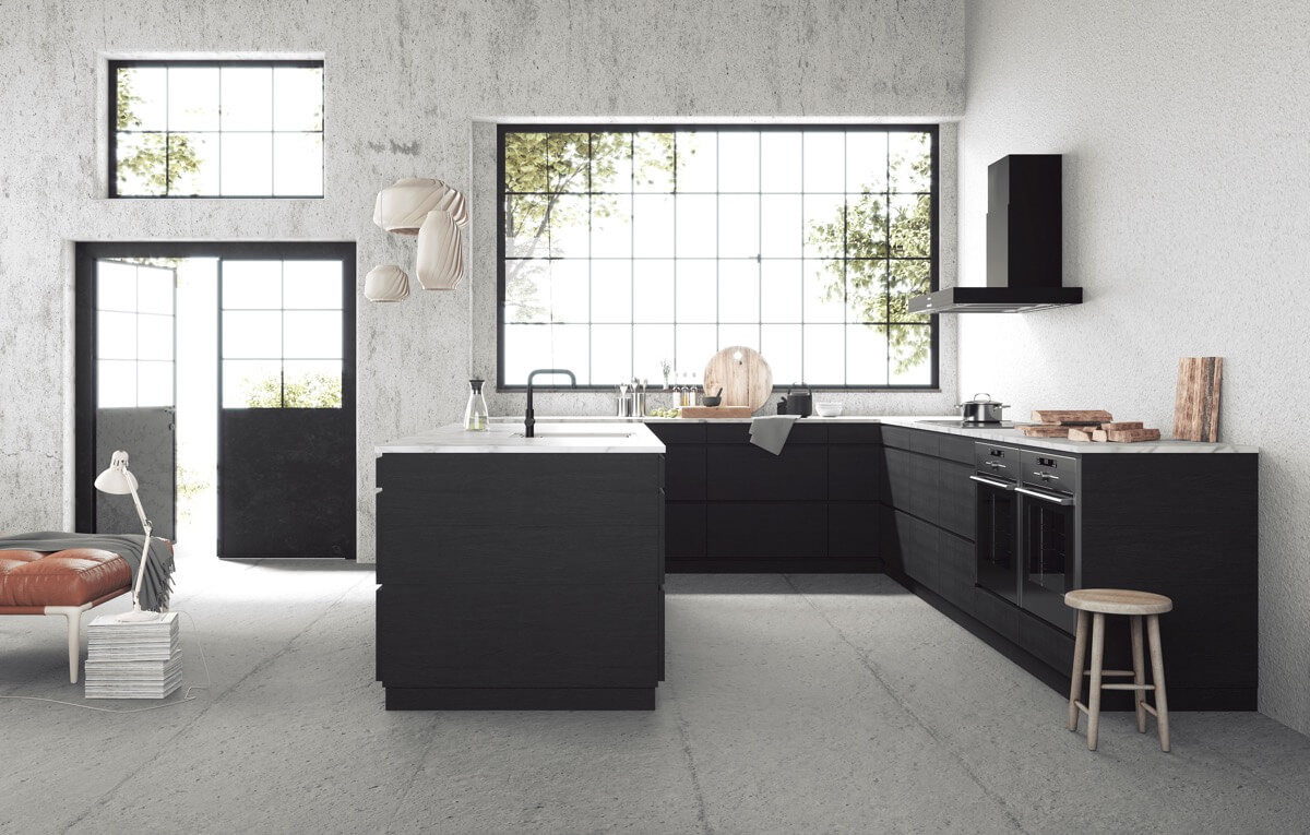
U-Shaped Kitchens with Concrete Floor: Industrial Chic at Its Finest
U-Shaped Kitchens have always been celebrated for their practicality and flexibility.
However, when paired with design elements like a Concrete Floor, they transcend from mere functionality to embody a distinct aesthetic—industrial chic.
Incorporating a raw concrete kitchen floor in U-Shaped Kitchens lends an urban, gritty edge to the space.
This minimalist and rugged flooring not only offers durability but also acts as a neutral canvas that complements the U-shaped layout’s streamlined design.
The concrete floor, with its subtle variations and texture, introduces a tactile element that contrasts beautifully with sleek cabinets and modern appliances.
While U-shaped kitchens are popular due to their flexibility in accommodating various design themes, the introduction of a concrete floor distinctly elevates this setup.
It harks back to loft-style, industrial spaces where raw materials and open layouts reign supreme.
To further accentuate this design, consider adding industrial light fixtures, exposed pipes, and metal accents.
The result is a U-Shaped Kitchen that seamlessly melds form and function, all underpinned by the raw elegance of a concrete floor.
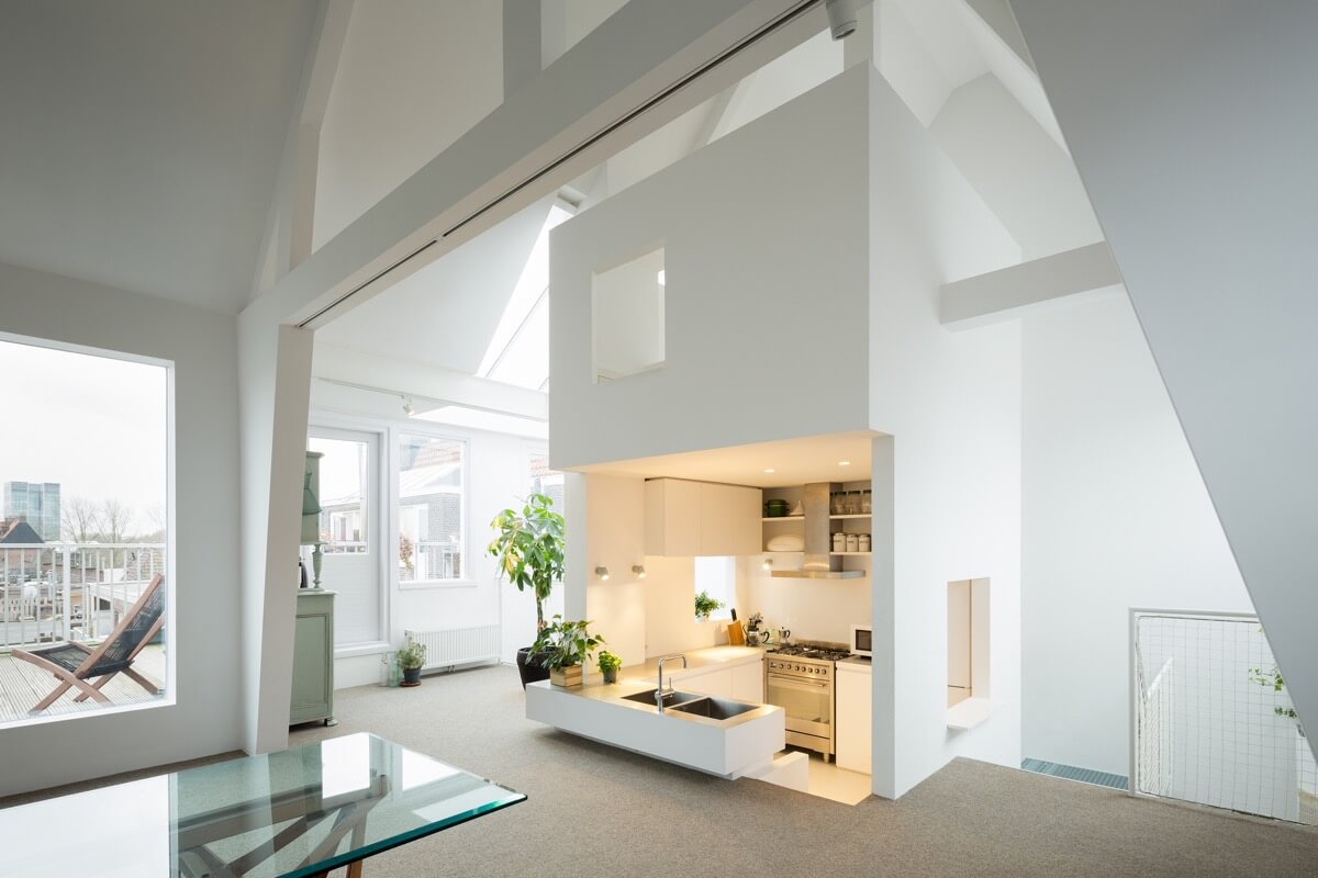
U-Shaped Kitchens at a Different Floor Level: A Unique Perspective
In the evolving world of interior design, U-Shaped Kitchens are not just about the layout anymore; they’re about creating unique spatial experiences.
A recent trend has been to play with the Floor Level, adding depth and dimension to open-concept spaces.
Imagine stepping into an open-concept living room, where instead of the usual seamless transition to the kitchen, you’re met with a surprising twist: the U-shaped kitchen is subtly submerged below the living area’s floor level.
This design choice grants spectators an elevated, seeing view of the kitchen from the living space, turning daily culinary activities into a visual treat.
This floor-level variation not only adds architectural intrigue but also helps demarcate the kitchen space in an open floor plan without the need for walls or partitions.
It’s an innovative way to retain the openness of the layout while still providing a sense of separation.
Moreover, the lowered U-Shaped Kitchen can be complemented with stepped seating or bar stools at its periphery, allowing for casual dining or interaction with the chef without intruding into the workspace.
In conclusion, manipulating the Floor Level in U-Shaped Kitchens offers a fresh take on open-concept living, creating zones not through barriers but through intriguing level changes that captivate and fascinate.
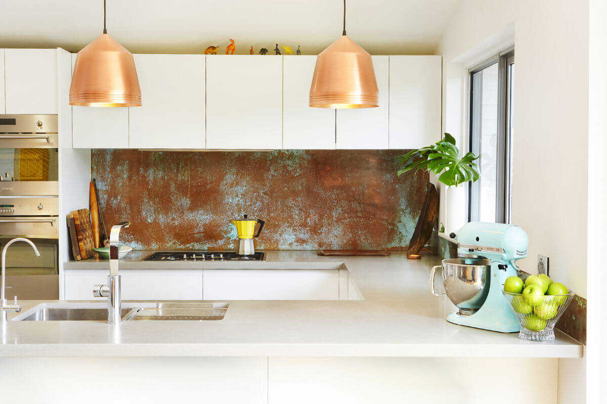
White U-Shaped Kitchens: The Charm of Unusual Touches
U-shaped kitchens have always been cherished for their efficient use of space and seamless flow.
When it comes to White U-shaped kitchens, the simplicity and brightness of the color palette offer a pristine backdrop that can be jazzed up with distinctive additions.
Unusual touches truly bring out the character in such spaces. For instance, in a predominantly white kitchen, the gleam of a copper chandelier can be both a striking focal point and a source of warm, ambient light.
Hanging elegantly above the center of the U-shaped layout, the chandelier’s metallic hue contrasts beautifully with the white surroundings, introducing a touch of luxury and drama.
Furthermore, a kitchen backsplash, often considered a functional element to protect walls from splashes, can be transformed into a design feature.
Choosing materials or patterns that contrast with the predominant white—perhaps a mosaic or a textured finish—it adds depth and dynamism to the overall design.
In conclusion, White U-Shaped Kitchens provide the perfect canvas for homeowners and designers to experiment with.
By introducing unconventional elements like a copper chandelier or a standout backsplash, one can elevate the space, adding layers of elegance and energy to the heart of the home.
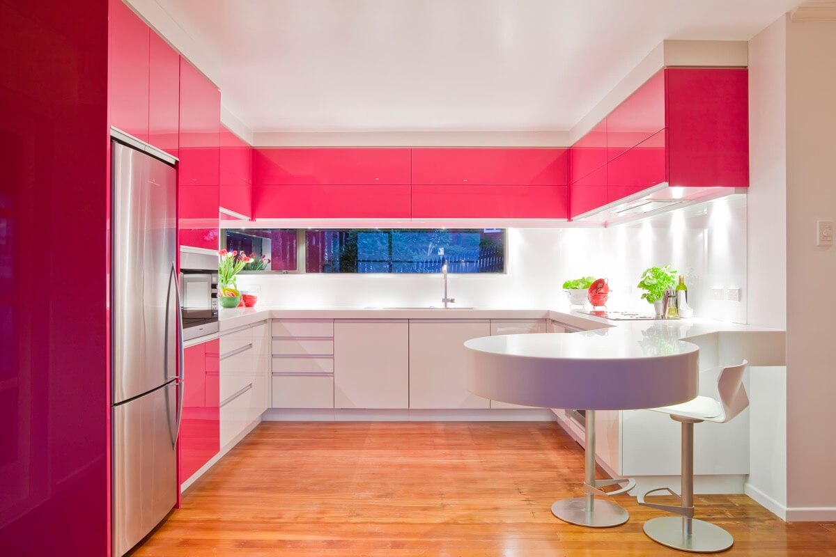
Red & White U-Shaped Kitchens: A Bold Statement in Sophistication
U-Shaped Kitchens have long been celebrated for their perfect balance of form and function.
They encapsulate an innate sophistication, allowing for a seamless flow in culinary activities.
Introducing a vibrant colour scheme, such as Red & White, can elevate this inherent elegance to new heights.
In a Red & White U-Shaped Kitchen, the colours can play off each other to create a dynamic visual experience.
Consider a bold stripe or gradient: the pristine white forming the primary canvas, with dashes of red introducing vibrancy and warmth.
This combination can be particularly striking when incorporated into cabinetry or a backsplash.
For instance, white upper cabinets contrasted with red lower cabinets or a white countertop juxtaposed with a bold red peninsula can offer a contemporary flair.
The choice of a peninsula in such kitchens not only extends the workspace but also serves as a focal point where the Red & White theme can be accentuated.
It could be as simple as red bar stools lining a white peninsula or a red accent wall highlighting the space.
In essence, the combination of Red & White in U-Shaped Kitchens provides a harmonious blend of passion and purity.
While U-shaped kitchens inherently ooze sophistication, this colour duo ensures that the space also resonates with energy, warmth, and modernity.
Dining Room Designs
Take inspiration from these stunning dining room designs. Dining rooms are unique places where treasured memories are made.

